Quickteller Travel: A Story of Rebuilding, Reimagining, and Believing Bigger
Quickteller Travel
Quickteller Travel: A Story of Rebuilding, Reimagining, and Believing Bigger
Quickteller Travel
Quickteller Travel
Designing Quickteller Travel — A Story of Rebuilding, Reimagining, and Believing Bigger
Designing Quickteller Travel — A Story of Rebuilding, Reimagining, and Believing Bigger
Project overview
Project overview
Designers: Femisola Fatogun
Duration: 3 months
What I worked on
What I worked on
Design Direction
Product Direction
All screens and flows
Where It All Began
Where It All Began
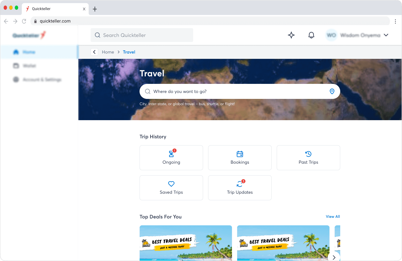
When I joined the Quickteller Travel project, the initial brief sounded simple:
“Take what exists and recreate it as a standalone travel website.”
“Take what exists and recreate it as a standalone travel website.”
But after reviewing the earlier designs, it was clear that this approach would not meet the ambition the business envisioned. The travel space is brutally competitive, users compare your platform to Booking.com, Kayak, Expedia, and Wakanow in seconds.
And with what existed, we simply couldn’t compete.
The Turning Point
The Turning Point

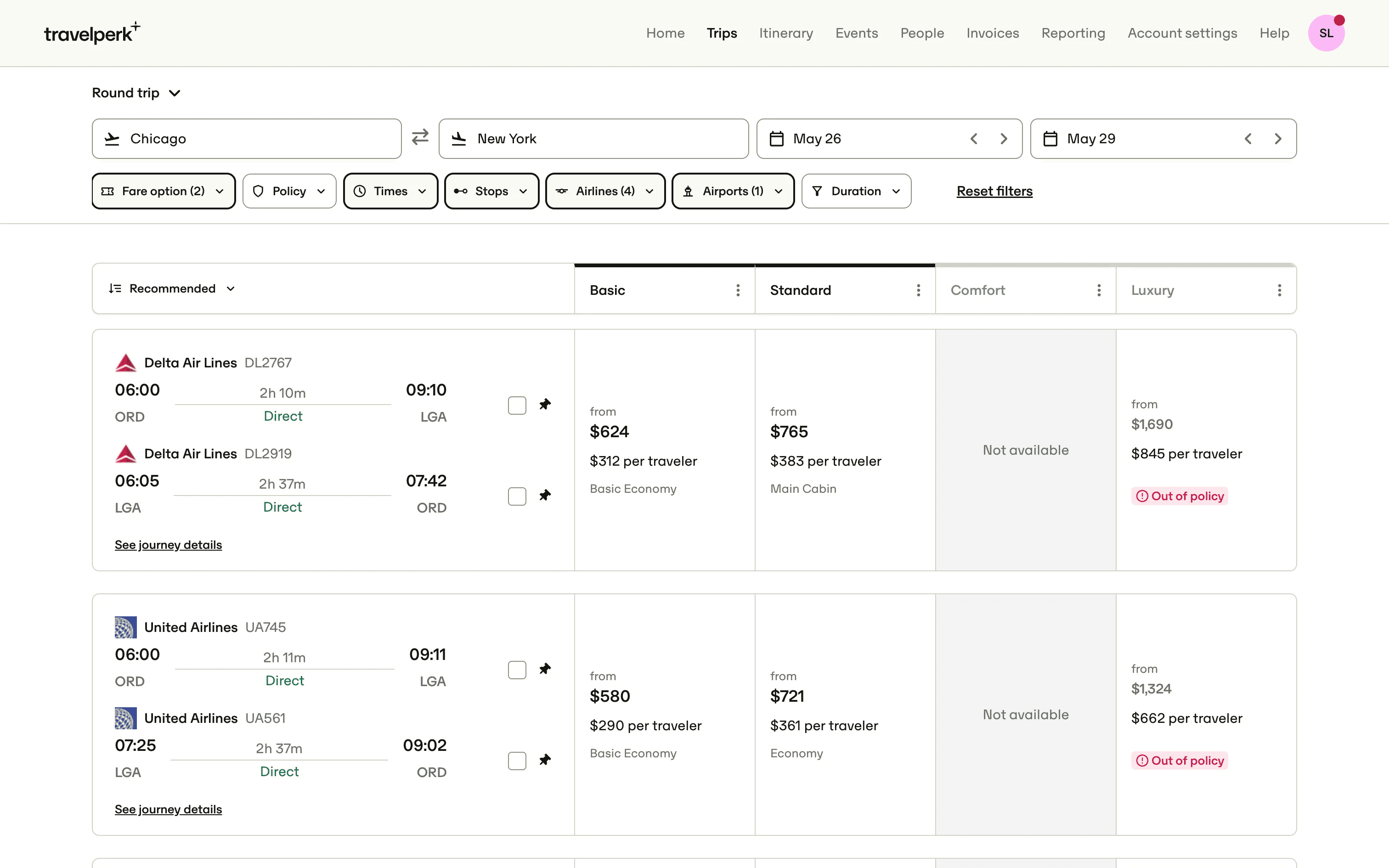

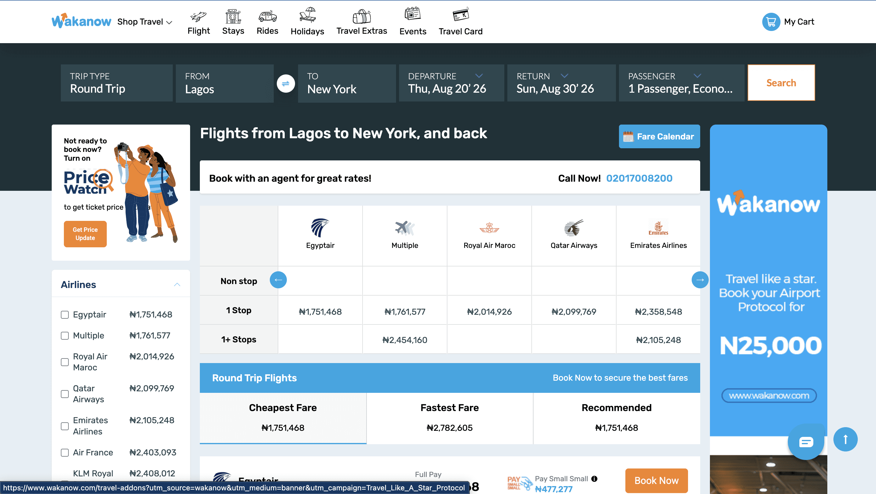


After benchmarking the old designs against global leaders, the truth was obvious:
✔ The flow lacked clarity
✔ The structure lacked scalability
✔ The design lacked differentiation
✔ The experience lacked value
So I made a bold recommendation:
After benchmarking the old designs against global leaders, the truth was obvious:
✔ The flow lacked clarity
✔ The structure lacked scalability
✔ The design lacked differentiation
✔ The experience lacked value
So I made a bold recommendation:
“we need a complete overhaul. not a replication. a reinvention”
“we need a complete overhaul. not a replication. a reinvention”
This shifted the entire project trajectory.
This shifted the entire project trajectory.
Stepping Into a Hybrid Role
Stepping Into a Hybrid Role
The documentation provided wasn’t robust enough, so alongside design, I also helped define:
Product requirements
User types
Booking logic
Value proposition
Core travel flows
Hotel booking scope
Multi-city logic
Sabre integration constraints
This hybrid designer–PM role helped us unblock ambiguity and move with clarity.
Starting From the First Touchpoint — The Landing Page
Starting From the First Touchpoint — The Landing Page


Before designing flows, I explored multiple landing page directions — because this page needed to:
Capture attention
Create trust
Deliver value instantly
Reflect global-standard craft
This set the visual language for the entire product and influenced other Quickteller consumer-facing products.
Before designing flows, I explored multiple landing page directions — because this page needed to:
Capture attention
Create trust
Deliver value instantly
Reflect global-standard craft
This set the visual language for the entire product and influenced other Quickteller consumer-facing products.
Stakeholder Alignment
Stakeholder Alignment
We pitched the new direction to senior stakeholders.
The alignment we got here helped unlock the next phase.
We pitched the new direction to senior stakeholders.
The alignment we got here helped unlock the next phase.
Designing the Core Booking Experiences
Designing the Core Booking Experiences


Here, we designed around real constraints:
Sabre behaviours
Split PNR handling
Airline rules
Fare families
Seat maps
Refundability
Ancillaries
Payment rules
This wasn’t just interface design — it was service design, deeply tied to travel infrastructure.
Here, we designed around real constraints:
Sabre behaviours
Split PNR handling
Airline rules
Fare families
Seat maps
Refundability
Ancillaries
Payment rules
This wasn’t just interface design — it was service design, deeply tied to travel infrastructure.
Hotel Booking
Hotel Booking
Tours
Tours
Checkout Experience
Checkout Experience


Itinerary
Itinerary
Usability Testing & Iterations
Usability Testing & Iterations


We tested across two traveler archetypes — Wealth, the experienced traveler, and Tomi, the first-timer. The goal wasn't just to find problems. It was to understand where the design held up, and where it got in the way.
Mostly, it held up. One-way booking landed an 85.7% success rate. Round trips completed at 100%. The layout felt immediately familiar, users moved through the core flow with confidence.
But a few moments broke that confidence.
The Search Flights button staying active on the results page made users question whether their search had gone through. Seat selection had a 61.9% misclick rate, not because the map was unclear, but because nothing confirmed a choice had registered. Filters blended into the interface, invisible to the users who needed them most. And "Returning on" told users when they were coming back, not where.
We tested across two traveler archetypes — Wealth, the experienced traveler, and Tomi, the first-timer. The goal wasn't just to find problems. It was to understand where the design held up, and where it got in the way.
Mostly, it held up. One-way booking landed an 85.7% success rate. Round trips completed at 100%. The layout felt immediately familiar, users moved through the core flow with confidence.
But a few moments broke that confidence.
The Search Flights button staying active on the results page made users question whether their search had gone through. Seat selection had a 61.9% misclick rate, not because the map was unclear, but because nothing confirmed a choice had registered. Filters blended into the interface, invisible to the users who needed them most. And "Returning on" told users when they were coming back, not where.


Before Testing
Before Testing
Before Testing
After Testing
After Testing
After Testing


Before Testing
Before Testing
Before Testing
After Testing
After Testing
After Testing
Each issue became a targeted fix. A quieter CTA once results loaded. A clear seat confirmation state. Filters that actually read as filters. A round trip label that showed the full route — not just the date.
The experience stopped getting in its own way.
Each issue became a targeted fix. A quieter CTA once results loaded. A clear seat confirmation state. Filters that actually read as filters. A round trip label that showed the full route — not just the date.
The experience stopped getting in its own way.
Final Pre-Launch Experience
Final Pre-Launch Experience
Even before launch, we have a platform that:
Competes against global travel apps
Scales technically and visually
Aligns with Quickteller’s Rebirth system
Supports multiple future features
Feels seamless and confident for users
Even before launch, we have a platform that:
Competes against global travel apps
Scales technically and visually
Aligns with Quickteller’s Rebirth system
Supports multiple future features
Feels seamless and confident for users
Looking Back
This project taught me:
How to challenge direction confidently
How to influence product strategy
How to design within aviation constraints
How to manage stakeholders effectively
How to test meaningfully
How to lead product direction end-to-end
This project taught me:
How to challenge direction confidently
How to influence product strategy
How to design within aviation constraints
How to manage stakeholders effectively
How to test meaningfully
How to lead product direction end-to-end
“It is a statement of what african products can become on the global stage”
“It is a statement of what african products can become on the global stage”
And I’m proud to have shaped that journey.
And I’m proud to have shaped that journey.